Scriptina has haphazardly turned into a type legend. Its crowded loops and poorly spaced whirligigs make me gag, while for others, this font makes them feel fine and flourishy. I remember when I first downloaded it in 2004. I have to admit after “growing up” with mediocre fonts like Rez and Fiolex Girls shortly before the year 2000, Scriptina did seem magical and new. But now that I am more experienced, there’s nothing attractive about this font anymore. And as more and more people somehow continue to use it for everything, I am amazed. Companies even use the name to describe products they make, such as this Scriptina Wedding Candle.
From what I can tell, Apostrophic Labs was responsible for unleashing Scriptina in 2001. If the person in this eccentric interview by True Type Resource really is linked to the font, it’s no wonder that he/she knew how to hook it into the minds of thousands.
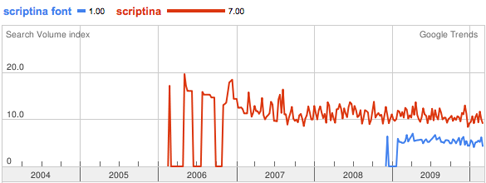
And there’s no mystery as to why we all continue to be bombarded by this font. Google Trends clearly shows that Scriptina is on an astonishingly steady rate of interest for the past few years.
Here are some recent finds I’ve had in my community. From strawberries I noticed at Publix,
To a local Orlando spa,
I see it multiple times a week on signs, labels, restaurant menus and more. It’s kind of like when you learn to read: when you learn what Scriptina is you can’t stop identifying it. Before I wrote this I looked around for others who share my dismay. I found that Mike wants to throw up when he sees it. Plus Rebecca wants to jump off a cliff when she sees the typeface whether it’s naked or in a fuzzy glow. And over at Typophile, there’s a history of Scriptina causing a whole heap of angry.
If you don’t understand what the big deal is by now, I’ll give you the breakdown. The crowd of us who are tired of this font is growing faster than the group discovering it for the first time. The cool factor of “Hey, that’s Scriptina!” is long gone. Now when we see it representing a person or a company, all we can think now is “Ugh.” We can no longer relate to what the company is trying to sell to us. We just see a font we’re sick of and wonder about how the designer put no thought into the brand. Then we think the brand doesn’t know anything about fonts or design. So then we surely don’t buy anything from them and move on to something that has advertising with tooth.
Lastly, if someone doesn’t do it soon, I’ll be creating the Wikipedia entry, because if any font deserves a history of its viral effect, it’s not just Helvetica anymore.


José Mário
Vencer, Vencer, Vencer… Esse é o Nosso Ideal!
Kayla
Obrigado por seu comentário!